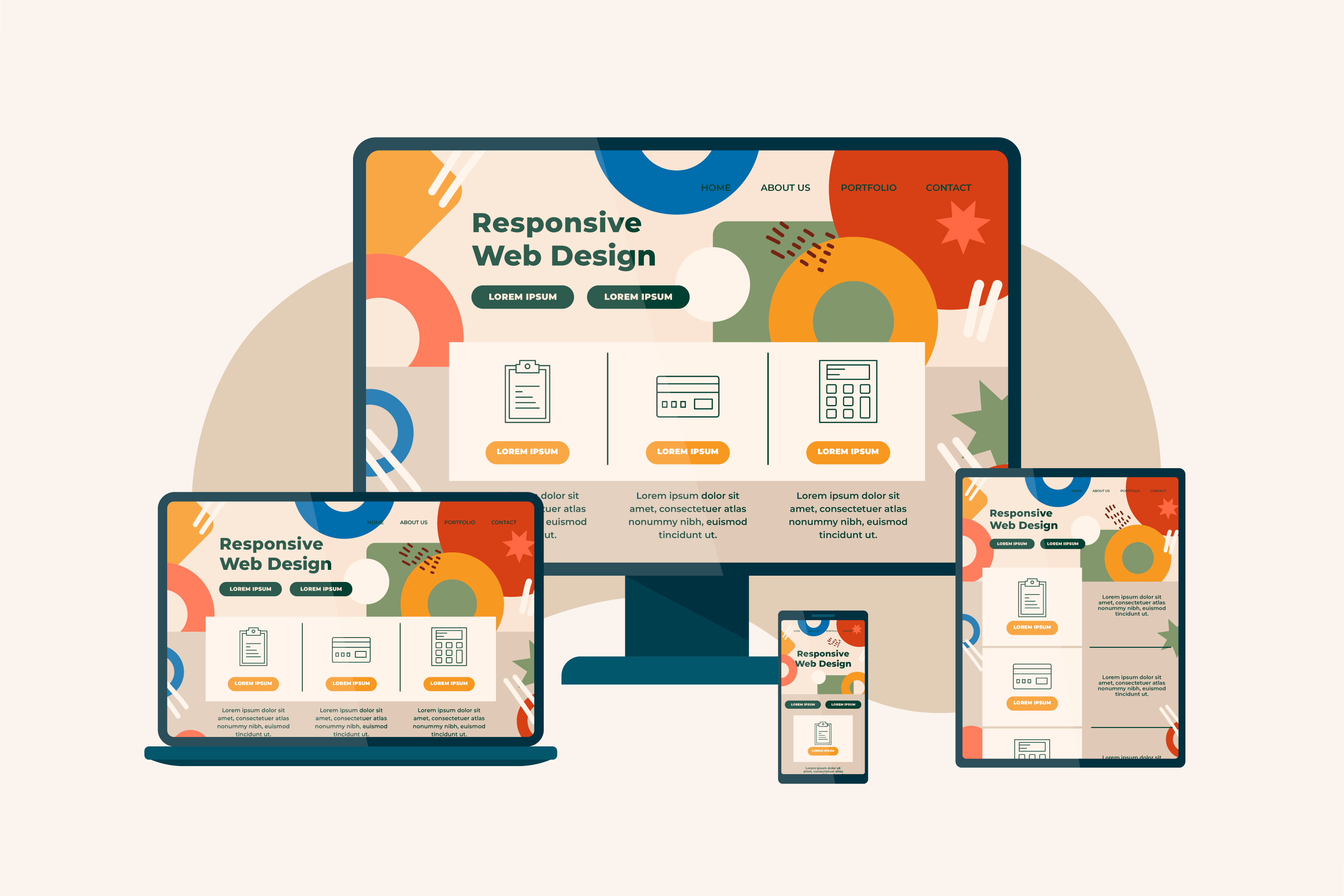
In today's digital-first world, your website is often the very first impression a potential customer has of your brand. If that impression is a clunky, hard-to-navigate page on a mobile screen, chances are the visitor will leave within seconds. This is exactly why more businesses are turning to a professional Web Design Company in India to build websites that look and function beautifully across every device. A responsive website isn't just a nice-to-have anymore; it's a fundamental requirement for staying competitive online. Whether you're a startup or an established enterprise, partnering with the right Web Design Company in India can make the difference between a visitor bouncing away and a visitor becoming a loyal customer.
What Exactly Is Responsive Website Design?
Responsive website design is an approach to web development where a single website automatically adjusts its layout, images, and content based on the screen size and device being used. Instead of building separate websites for desktops, tablets, and smartphones, responsive design ensures one flexible website adapts seamlessly to all of them.
This means whether someone visits your site from a laptop, an iPad, or a smartphone, they get an optimized viewing experience without needing to zoom, pinch, or scroll excessively.
Why Responsiveness Matters More Than Ever
1. Mobile Usage Has Overtaken Desktop
More people browse the internet on mobile devices than on desktops today. If your website isn't optimized for smaller screens, you risk losing a significant chunk of your audience before they even see what you offer.
2. Search Engines Prioritize Mobile-Friendly Sites
Search engines like Google use mobile-first indexing, meaning they primarily evaluate the mobile version of your website to determine rankings. A non-responsive site can seriously hurt your visibility in search results, no matter how great your content is.
3. Better User Experience Equals Better Engagement
A responsive design ensures:
- Faster loading times across devices
- Easy navigation with touch-friendly buttons
- Readable text without manual zooming
- Properly scaled images and videos
When users find your site easy to use, they stay longer, explore more pages, and are more likely to convert into customers.
4. Consistency Builds Brand Trust
Imagine visiting a website that looks polished on desktop but broken on mobile. It creates doubt about the credibility of the business. A responsive site maintains consistent branding, messaging, and functionality across all platforms, which builds trust with your audience.
Key Elements of an Effective Responsive Design
Flexible Grid Layouts
Instead of fixed pixel widths, responsive websites use flexible grids that resize proportionally based on the screen.
Scalable Images and Media
Images and videos are designed to shrink or expand without losing quality or breaking the page layout.
Breakpoints for Different Devices
Designers set specific breakpoints where the layout adjusts, ensuring optimal display on phones, tablets, laptops, and large monitors.
Touch-Friendly Navigation
Menus, buttons, and forms are designed to be easily tappable on touchscreens, improving usability for mobile users.
Business Benefits of Going Responsive
- Improved SEO rankings since search engines favor mobile-optimized websites
- Higher conversion rates due to smoother user journeys
- Wider audience reach across all device types
- Cost efficiency, as you maintain one website instead of multiple versions
- Future-proofing, since new devices with varying screen sizes continue to emerge
Common Mistakes Businesses Make
Many businesses assume that simply shrinking a desktop website is enough to make it "responsive." However, this often leads to:
- Text that's too small to read
- Buttons that are hard to tap accurately
- Slow loading due to unoptimized images
- Content that overflows or gets cut off
Avoiding these issues requires thoughtful planning and testing across multiple devices and screen resolutions, something that experienced designers prioritize from the very start of a project.
How to Ensure Your Website Stays Responsive
- Regularly test your website on different devices and browsers
- Optimize images and media files for faster loading
- Use flexible layouts rather than fixed dimensions
- Prioritize mobile usability during the design process, not as an afterthought
- Keep design elements simple and uncluttered for smaller screens
Responsive website design isn't just about aesthetics, it's about creating a functional, accessible, and engaging experience for every visitor, regardless of the device they use. As user expectations continue to rise and mobile browsing dominates internet usage, businesses that ignore responsive design risk falling behind their competitors.
Working with a skilled Web Design Company in India ensures your website is built with the latest responsive design principles, giving your business the best chance to engage visitors, rank well on search engines, and convert traffic into loyal customers. If you're planning to build or upgrade your website, choosing the right Web Design Company in India could be the smartest investment you make for your brand's long-term online success.